In the previous post, we made our css emotion like function and in this blog post, we are going to extend our css function to support the following style-components syntax.
const Button = styled('button')(
  {
    backgroundColor:  "blue",
    color: "white"
  }
)
A few things to note when exploring the API are: ```jsx // On breaking into parts: const Button = // <-- Part: 3 styled('button') // <-- Part: 1 ({ backgroundColor: 'blue' }) // <-- Part: 2
- Part 1: The `styled` function takes the `tagName` that has to be created i.e

```jsx
 styled('button') <-- 1

// is equivalent to

<button>
- Part 2: The
styled(tagName)returns a function that acceptsstyle-objectwhich will be used to style thistagNameelement.
({ backgroundColor: "blue" }) <-- Part 2

// is converted to

css({ backgroundColor: "blue" })

// and passed to the component as

<button className={css(...)} />
- The complete call returns a React component
Buttonthat renders abuttonwith a given style.
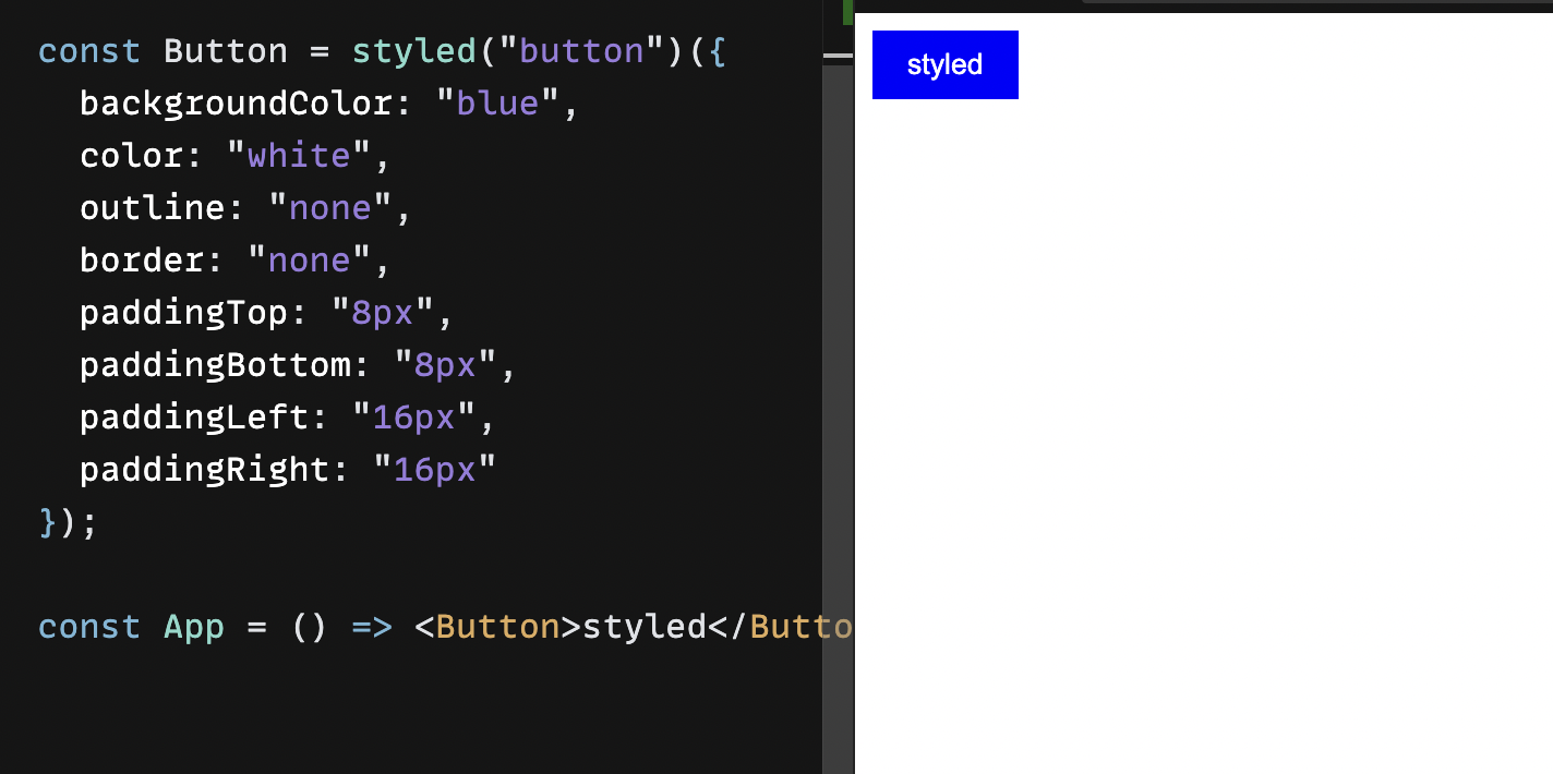
From the above points, we can write a rough husk of our styled function
// Part 1: styled('button'): element of type tagName to render
function styled(tagName) {
  // Part 2: style('button')({ color: 'white' }) takes in the style object and applies these styles to `tagName=button` component

  return function applyStyles(styleObject) {
      // Part 3: `Button` react component
      return function Component(props) {
          // ...styling and element creation...
          // Mark: 1
      }
  }
}
Now in place Mark: 1 we need to do the following:
Create an element using
React.createElementof typetagNamePass
style-objectintocssfunction to generate name, as props may already contain some className so compose these className together.
// continue from Mark: 1

const clonedProps = clone(props);
// a copy of props is required as by default react makes props immutable
// and if we want to modify any props we need to make a copy for our use

// compute a className for styleObject
const generatedClassName = css(styleObject);

// compose className
const className = generatedClassName + props.className ? + ` ${props.className}` : '';

// reassign composed className
clonedProps.className = className;

// create element of type `tagName` with props = `clonedProps` and `style=generateClassName`
const element = React.createElement(tagName, clonedProps);

// The `element` is of type `tagName` and of `styles=styleObject` this is one we want to render

return element;
That is what the style-components version of our CSS-in-JS library looks like. clone function can be as simple as:
const clone = (obj) => Object.assign({}, obj);
More reads on the CSS-in-JS:
About the author
I’m a software ninja 🥷 who loves abstractions and spread functional programming everywhere. I've over 2 years of experience and I'm based in Delhi, India🇮🇳
Comments
Join the discussionNo comments yet. Be the first to comment.