Creating component variants with ease
I’m a software ninja 🥷 who loves abstractions and spread functional programming everywhere. I've over 2 years of experience and I'm based in Delhi, India🇮🇳
There are times when you are writing your UI component and want to add style variants to it. A button component can be a "primary" button with a "blue" background or a "secondary" button with an "orange" background. If I asked you to create a button that can take an intent prop and render itself as a "primary" blue button or a "secondary" orange button.

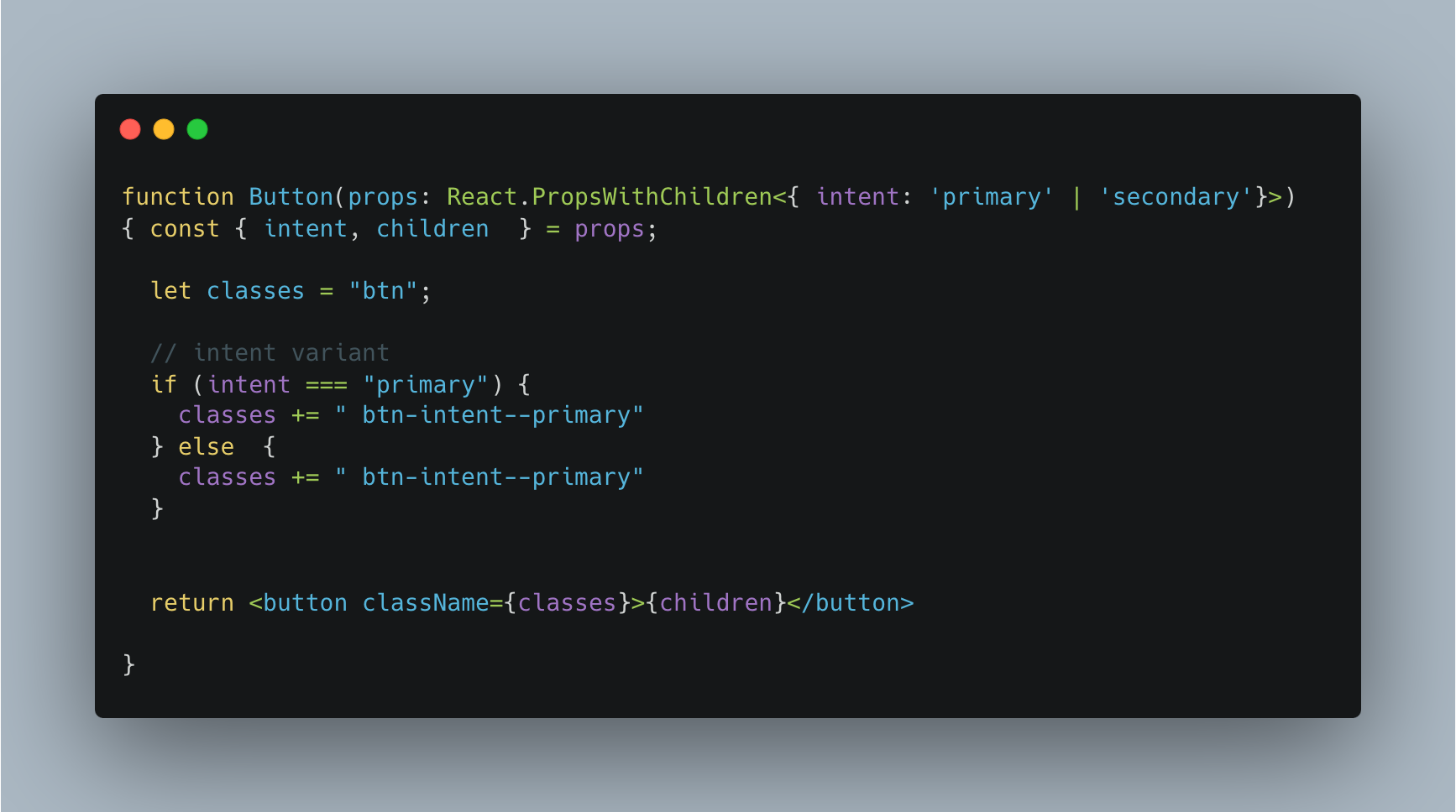
You would be writing ugly if-else statements to match the styles for the intent variant. Something like the following may be your code:

That may not look very ugly but imagine as the number of variants grows and there are values, you will have to put a lot of ugly if-else statements for styling only.
@vtechguys/vs
Let me introduce you to an npm library that will do all that for you.
import { GetVariantProps, vs } from "@vtechguys/vs";
import clsx from "clsx";
import React from "react";
import "./styles.css";

export const button = vs({
  base: "btn",
  variants: {
    intent: {
      primary: "btn-intent--primary",
      secondary: "btn-intent--secondary"
    },
    size: {
      small: "btn-size--small",
      medium: "btn-size--medium"
    }
  },
  defaultVariants: {
    intent: "primary",
    size: "medium"
  }
});

export type ButtonVariantProps = GetVariantProps<typeof button>;

type ButtonOwnProps = {
  // ... some button props ...
};

type ButtonProps = React.PropsWithChildren<ButtonVariantProps & ButtonOwnProps>;

export function Button(props: ButtonProps) {
  const { intent, size, children, ...rest } = props;

  // applied classes list
  const variants = button({ intent, size });
  const classes = clsx(variants);

  return (
    <button className={classes} {...rest}>
      {children}
    </button>
  );
}
As you saw the library took care of all style mapping and generated applicable classes for you.
Facts from @vtechguys/vs documentation:
🫶 Framework agnostic
🔥 Typesafe
🤏 Super tiny bundle size
Let's simplify things by using this tiny package and create awesome variant components for your design system.


